My HCLSoftware case study
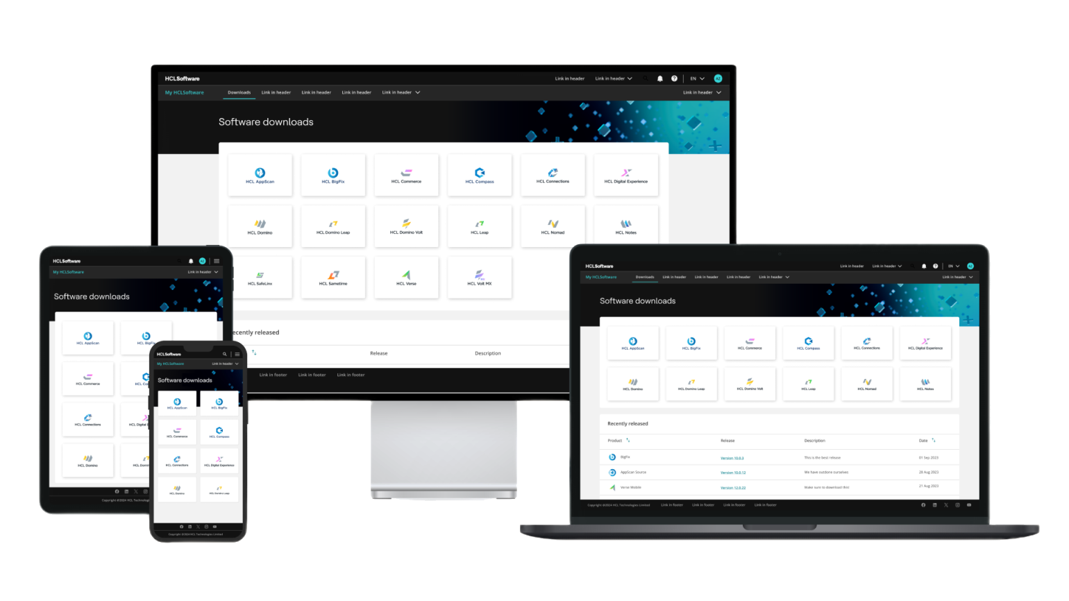
- $2M+ savedby building an internal platform instead of paying for an external one.
- 3 to 6+ out of 7customer satisfaction, before and after release.
- Days to minutestime to start a Marketplace trial.
- Tens of millions of dollarsin pipeline across the two portals.
- 40+ productson My HCLSoftware.
- 59 products22 business solutions, 25 partner offerings on Marketplace.
In 2022, before BigFix, before Mandala, Aaron Bauer and I opened a blank screen and began to build My HCLSoftware.
This kind of project is every designer's dream and every designer's fear at the same time. The dream is simple: hardly anyone gets to build a product from nothing, exactly as they believe it should be. The fear is the other side of the coin, because when nothing exists yet, every decision is yours, and so is every mistake.
We chose to treat the fear as the brief, and we began with the people rather than the pixels. Research came first, then the customer journey, so that every screen we drew answered something a real customer needed to do. On release, customer satisfaction roughly doubled.
What we built did not stay in one portal. The design language and components became the foundation of Marketplace, then of BigFix, and now of Mandala. That is the kind of work I do: not standalone UIs, but foundations other teams can stand on.
Project overview
The aim was to align two key customer-facing portals and create a set of designs and standards that would give them one consistent experience and serve as the basis for further portals. Marketplace is where customers discover, try and buy HCLSoftware products, and it is the strategic SaaS sales platform. My HCLSoftware is where they manage what they have bought: a self-service portal for accounts, relationships, assets and services. Six goals shaped the work:
- An aligned experience across both portals
- Easier navigation
- International accessibility requirements met
- Lower costs for external portals
- Lower costs for design and development
- Standards that other external portals, such as documentation, could replicate
Starting with the people
The portals serve a wide range of users and flows, so the research had to be equally varied. It began with formative customer interviews to identify the personas and the pain points that already existed, continued with structured internal reviews that shaped an information architecture able to hold products with very different organisation and terminology, and included a beta, built both to evaluate the designs and to decide what to prioritise next.
The customer journey map then gave the whole organisation one view of how a customer engages with HCLSoftware and which resources help them succeed at each stage. It informed everything from leadership conversations about direction to the UI decisions of individual project teams.
The origin and the collaboration
Aaron Bauer is a principal designer I have partnered with closely for more than five years, through some of the most demanding projects of my career, and he now leads design across BigFix. I have learned more from him than from anyone else, about UX and about enterprise software, and our collaboration is one I hugely value. Ours has rarely been a divided practice: from MHS onward, we have built things with four hands rather than each retreating to a separate lane.
A blank screen leaves no one to blame. There was no inherited pattern to explain an awkward choice and no legacy to excuse a compromise, so usability and accessibility were engineered in from day one rather than retrofitted later. Colour, breakpoints, the order in which focus moves through a page and the regions a screen reader announces were all decided together with the overall experience, never afterwards. It was the chance to show what we both believe: a design can be beautiful, usable and accessible all at once.
Marketplace
Aaron and I owned MHS. Marketplace was owned by Katie Rossi, a designer we worked with very closely and whom I still deeply admire and enjoy working with. Aligning our two products was a directive, but a directive says what to achieve, not how. Katie adopted the design language I had built, then its components and eventually its patterns, and every decision about how each one landed on her product was made with her, not for her. Some of those patterns we built together, and they belong to both of us.
Marketplace had a clear target: to increase online sales through SaaS and self-service. Starting a trial went from a wait of days or weeks to a matter of minutes, a result the whole Marketplace team earned and one the shared design language helped make possible.
That collaboration held through a corporate rebrand a year later, when the system had to absorb new brand guidelines without losing what made it accessible or coherent. We integrated as much of the new branding as we could without compromising accessibility or usability, worked with marketing on the terms of adoption, and ended up sharpening the distinction between light and dark mode along the way.
Accessible by design, documented and from day one
I built the two libraries that hold all of this: the Accessible Design Language and the Accessible Components. Every component in them was built to WCAG 2.2 AA as a floor, not a target. Accessibility is the right and ethical thing to do, and it is also a legal and commercial requirement, because it allows the products to sell to every customer in the US and Europe, including government institutions.
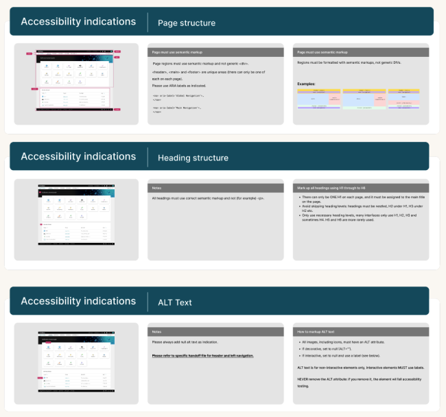
It is built into how designs are delivered as well. Every handoff carries full accessibility indications, from page regions and keyboard order to alt text, labels on icon buttons, heading hierarchy and component behaviour, together with the responsive design and spacing, so developers never had to make design decisions themselves or keep asking us for clarification, and QA always had something concrete to check against.
Much of what we designed had to be templates for requirements that nobody yet knew, which is a very different discipline from designing a screen for a known need. It is part of why the foundation could later carry BigFix: the libraries proved stable enough to be used well beyond the product they were made for. MHS and Marketplace still run on them, and BigFix, a completely different set of products at a much larger scale, adopted them as its foundation too. They are now also the base of Mandala.
I build things that scale, not single UIs, and this is the clearest example I have: one foundation that grew from a single portal to a whole product family without ever being replaced. That is the test I care about most: a system earns its name when a team building something different can start from it instead of starting again.
Responsive and navigation
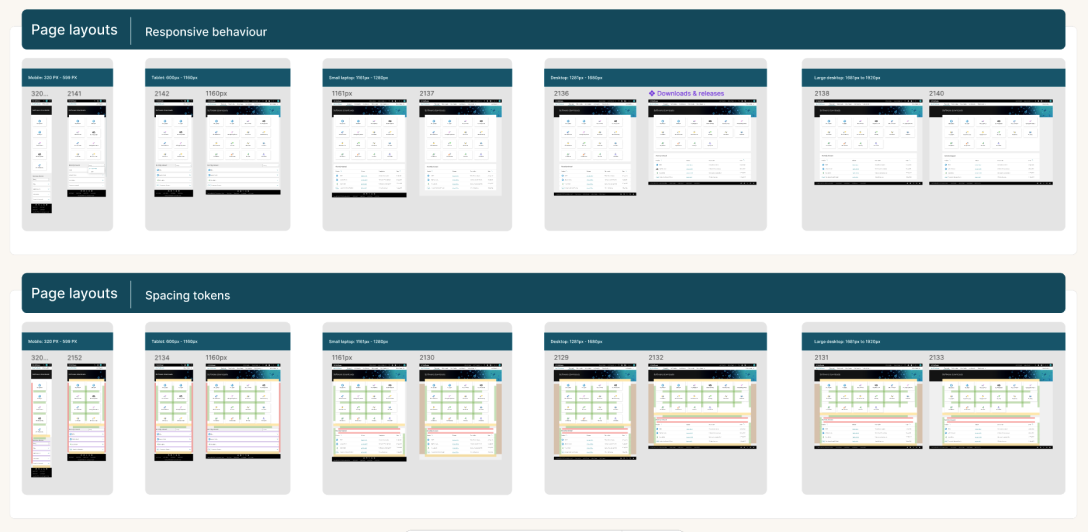
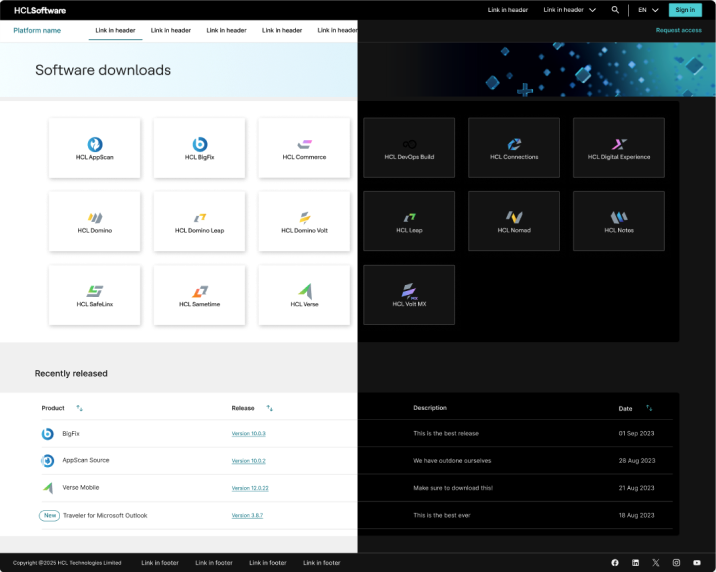
A single set of breakpoints, from large desktop screens down to mobile, applies consistently across both portals, so the experience behaves the same on every device and meets accessibility requirements.
HCLSoftware's customer-facing sites are built by independent groups and are, at best, loosely connected. We built a header system that lets users know at once that they are on an HCLSoftware page, makes it easy to move within and between portals, and is designed to support the portals that will join over the coming years.
MHS is where the standard started: beautiful, usable and accessible, together, never traded off against each other.
I no longer design on it day to day, because BigFix and Mandala have my full attention, but I still give MHS UI feedback and advice regularly, and an MHS developer now takes part in Mandala's code reviews. Once Mandala is ready, MHS and Marketplace will adopt it, as BigFix will, so what began on a blank screen in 2022 is returning to the products it was first made for, now strong enough to carry BigFix alongside them.