BigFix case study
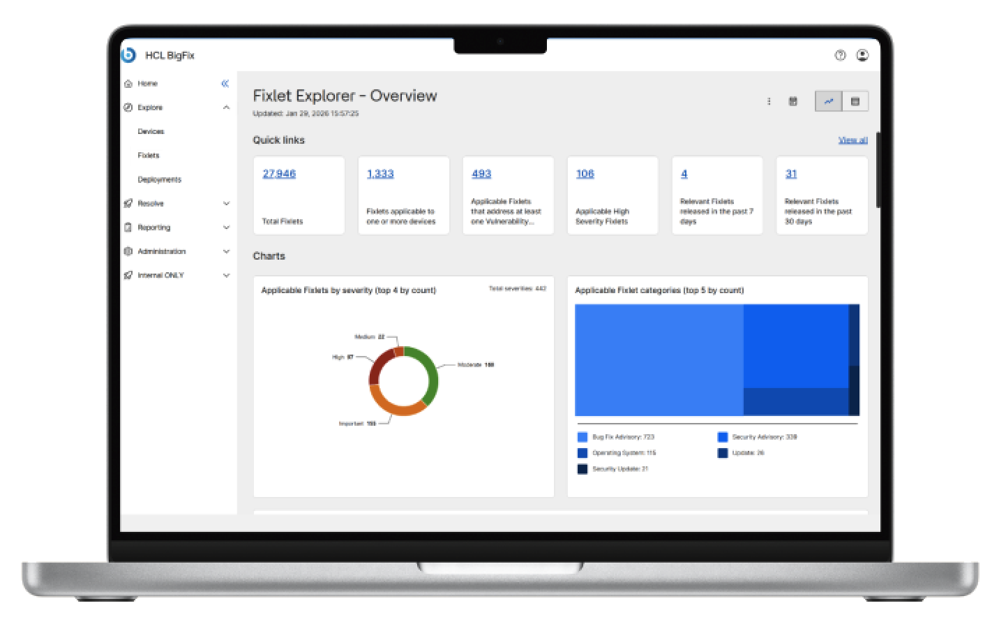
- 100+screens delivered.
- 6+ productsunified, and counting: on-prem, SaaS, IVR, DEX, MCM and SSA.
- 10 designersled across Italy and India.
- 1 architecturefrom grids to charts.
- 20+layout patterns guarantee consistency.
- Accessibleby design.
Some of the people who use BigFix love it enough to have its logo tattooed on their skin. That is the trust I was asked to carry into a new interface when Aaron Bauer, who owns the project to rebuild the BigFix UI, asked for me by name, because he wanted to be sure it succeeded. The brief was to bring every BigFix product into one coherent, accessible, modern and attractive interface, one that finally looked as good as the product was trusted to be, without giving that fiercely loyal base any reason to feel the product had stopped being theirs.
My role, created for me
I own the UI of BigFix. I am the final decision-maker on how every screen looks and behaves, in a role that did not exist until it was created for me, and together with Aaron and the UX lead I steer the whole effort, working with stakeholders and leadership across the United States, India and Italy through several meetings every week.
I started from the grids and built upwards: the patterns every page is made of, the empty and error states, the architecture that six products now stand on. The design language I had already built for MHS and Marketplace gave me the foundation, and BigFix is where it grew into a much larger system, one that is now becoming Mandala, a fully AI-readable and compatible design system with a case study of its own.
Leading the team
I lead a high-performing team of ten designers, distributed between Italy and India. I took part in hiring some of them and mentor all of them, as well as four external designers currently collaborating with us, and I run team meetings every week so that the team always has the context, the trust and the room it needs to do its best work.
My own role has moved from hands-on design to review and final sign-off, and I share more of that review with the team every month, so that the quality of BigFix never depends on a single person. I keep the final sign-off; the judgement behind it is increasingly theirs.
The best part of it is that it is a team people are glad to belong to. They work hard, they trust each other, and they have the freedom to follow the work that interests them most. Some of what I am proudest of in this case study, like the Figma plugins they built to speed up handoff, came from them, not from me.
The mandate
BigFix is not one product. Long before it belonged to HCL it was a name IT professionals trusted, and the people who use it every day notice every change, because they live inside it for hours at a time. That made the stakes high in both directions: every change had to feel familiar to the people who already relied on it, and the new interface also had to become a real asset for the sales team, because in a competitive market the first thing a prospective customer judges is what the product looks like. It was a brief with very little room for a wrong answer.
The architecture
Building one architecture for six products meant that everything a page is made of had to share the same logic, not only the same look: the layouts, the components, the behaviours, the empty and error states and the charts. The foundation I had built for My HCLSoftware and Marketplace was a starting point, not a template. BigFix needed a new primary colour, a vastly larger component library and an entirely new chart library, because it runs on data in a way those earlier products never did.
Before: one product, many different looks
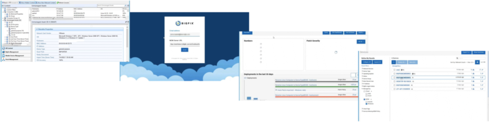
Now: a modern, consistent look and feel, accessible by design
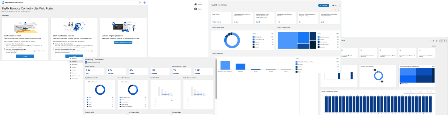
The chart problem
A chart with thirty data elements cannot have thirty accessible colours. Human vision does not support that many distinguishable hues, and colour blindness narrows the number further still. I built a six-colour palette within a single hue for the cases that need only that, and a separate eight-colour palette engineered to hold up under every major type of colour blindness while still meeting contrast requirements, and that was the ceiling.
Rather than fight the ceiling, I built the system around it. Every chart displays its top elements directly and groups the rest under “other”, and every chart, without exception, ships with a paired data table in a drawer that is sortable, downloadable and exact. A chart can struggle when a value of one sits next to a value of thirteen hundred, but the table never does, so accessibility is guaranteed at the system level rather than earned chart by chart. The table also makes every chart easier to read for everyone, which is what I have argued in accessibility training for years: accessibility is rarely a trade-off against a better experience, and usually it is the better experience.
Density, resolved by choice
BigFix's long-time users want maximum information on screen, while modern conventions favour breathing room and scrolling. I chose not to treat that as a fight to win and built the choice into the system instead. The left navigation collapses to icons for people who want the space, with labels still guaranteed on hover so nothing is lost to accessibility, and every data table offers three row heights, so each user sets their own density.
Nobody has to lose this argument, because the system holds both answers at once.
Filtering, built with the people who know it best
Filtering is one of the hardest interactions in enterprise software to get right, and the credit for solving it belongs to Aaron and the UX lead. They understood the product, its users and its technical limits well enough to define how filtering had to work. I joined at the end of that thinking, shaping how the pattern looks and fits into the system, which is the smallest part of the problem.
It is also one of the parts of this project I learned the most from. Watching them work through it taught me more about how people use BigFix than any brief could, and my job was to listen closely and make their solution look as good as it works.
The handoff framework
Handoff is where good design most often gets lost in translation, so nothing leaves the BigFix design team without a framework that answers developers' questions before they have to ask them. It sets out how every screen behaves from large desktop to mobile, and every accessibility decision a designer controls: page regions, heading hierarchy, tab order and where it must be deliberately forced, labels on icon-only buttons, alt text, spacing tokens and correct component usage. The result is code that is right the first time, a clear standard for QA to test against, and a clean line of responsibility: design guarantees accessibility on its side, and development and QA own it from there.
The framework has since become the team's own. When security restrictions ruled out off-the-shelf Figma plugins, the designers built their own to make handoff faster, and seeing them extend the system on their own initiative is one of the things I am proudest of as their lead.
6+ products speaking the same language, to everyone
The measure of this work is not any single screen. It is that six products now speak the same language, and that the people who have trusted BigFix for years can open any of them and still feel it is theirs, with accessibility built into every pattern and component so that everyone can enjoy it.
The designers who carry it forward understand it well enough to take it further than I could alone, and what began as the foundation for two portals is becoming something more ambitious still: Mandala.