Mandala: The story behind the name
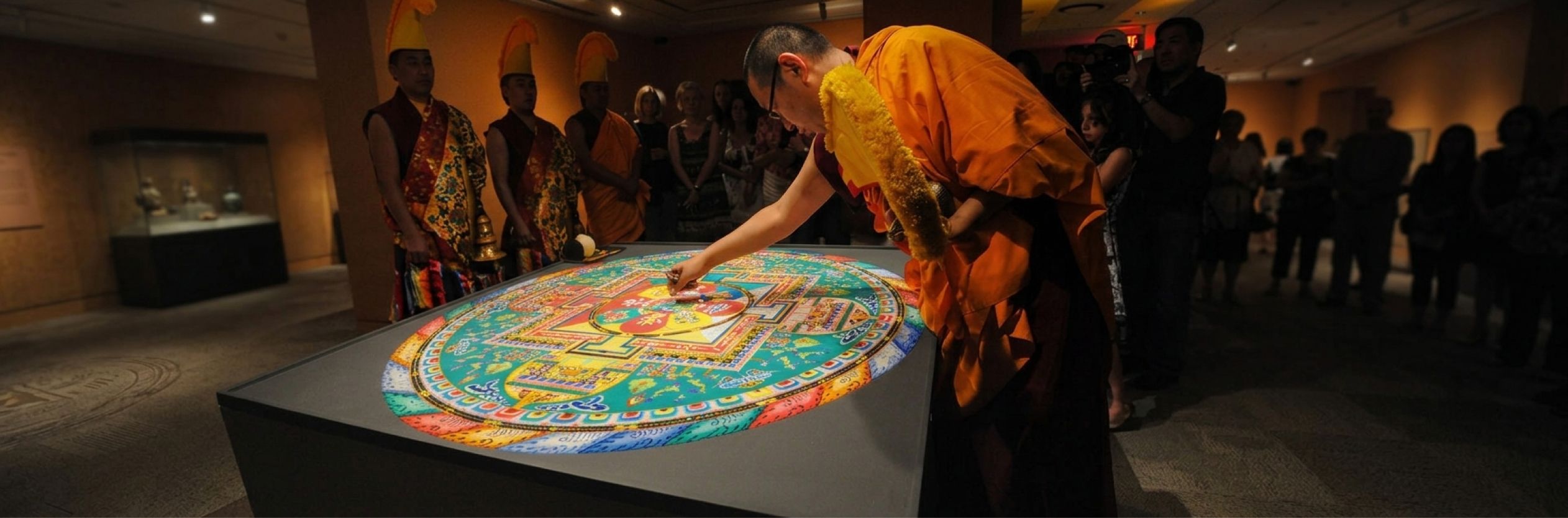
A mandala is never one thing. It is built from many small, disciplined pieces: repeated shapes, deliberate colour, each element following a rule so that the whole reads as coherent rather than chaotic. That is exactly what this design system is. Every token, every component, every accessibility rule is a small piece with its own discipline. None of them mean much alone. Together, they create something that feels whole, considered, intentional.
Harmony was never a decoration on top of the system. It is the system.
A mandala is made to be looked at, walked around, meditated on, drawn by a child or a master, and understood by anyone regardless of where they come from or what they bring to it. Nobody needs training to find meaning in one.
This design system carries that same intention: every person who touches the products I work on should be able to use them and enjoy them, without needing extra effort, extra tools, or extra explanation to do so.
Accessibility is woven through every piece of it in the same way a single colour or shape is woven through the whole of a mandala, never separable from the rest without the pattern breaking.
The scale of a mandala is not fixed either. Some are vast enough to cover a temple ceiling; others sit in the palm of a hand, and the small ones are not lesser versions of the large ones. They follow the same principles at any size, and you can always build outward from a smaller one without breaking its logic. That is the essence of this project: starting with icon, then button, then the rest of the library, each one adding to a structure that was designed to grow rather than be rebuilt.
Colour in a mandala is never arbitrary. Each one carries meaning, tradition, and intention behind it, never chosen for decoration alone. My colour palettes, from primitives through to semantic tokens, follow the same conviction: every value in this system exists for a reason, and that reason is documented, not assumed.
Then there is heritage: building a mandala is an Indian discipline, rooted in a tradition of geometry, symbolism, and craft that long predates the words “design system”. HCLSoftware is an Indian company, and there is something quietly right about a design system built here carrying a name with that heritage, rather than reaching for something borrowed from elsewhere.
Practically, the word travels. Mandala is recognisable and pronounceable across languages, it does not need translating or explaining, and the moment someone hears it they picture something: shape, colour, pattern, centre. Many small disciplined pieces creating harmony, one of them being a genuine commitment to inclusion, a form that scales without losing its logic, colour with real meaning, an origin that reflects the company building it, and a word that means something the moment you say it, in any language, to everyone.