Mandala: Typography, a study on internationalisation
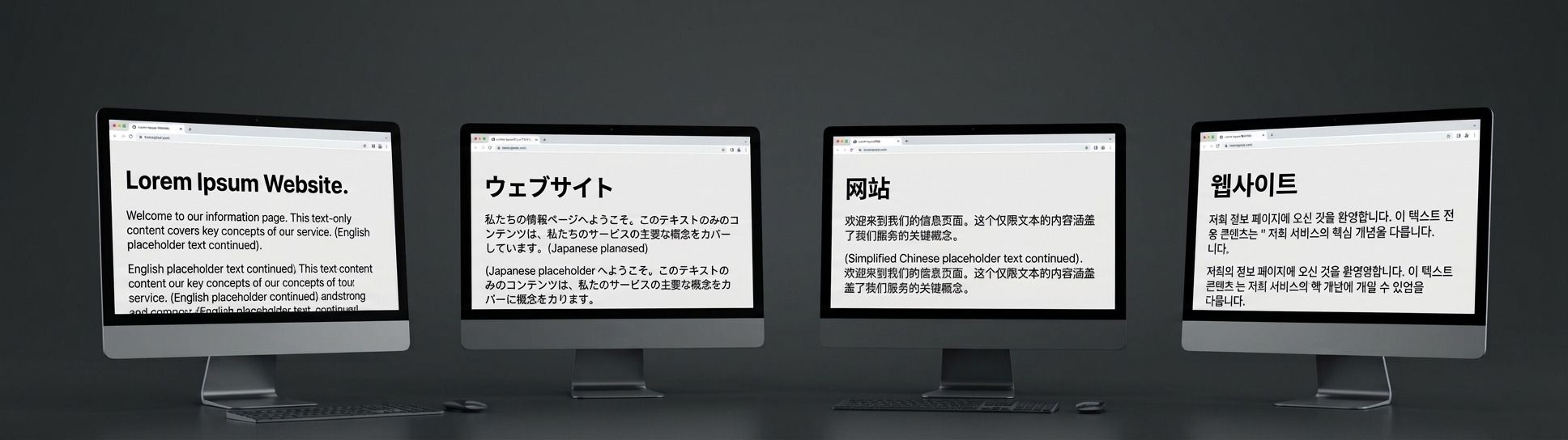
Will this text still fit in the UI?
Text in English (Font: Inter - Regular - 16px)
このテキストはUIにまだ収まりますか?
Text in Japanese (Font: Noto Sans JP - Regular - 16px)
这段文字在用户界面中还能放得下吗?
Text in Simplified Chinese (Font: Noto Sans SC - Regular - 16px)
이 텍스트가 여전히 UI에 들어갈까요?
Text in Korean (Font: Noto Sans KR - Regular - 16px)
Five screens, and a question nobody could answer from a spec sheet
BigFix's Unified UI is not built to be sparse. Scheduled Reports, Fixlet Explorer, Notifications and the Remote Control portal are dense because the administrators who run thousands of endpoints need them to be: they do not want fewer numbers on the page, they want more, faster. That density is a requirement of the product, and it is the constraint every decision below had to survive.
The type scale I had built for BigFix was drawn against that density in Latin script, with Inter sized and weighted to hold its own on busy screens. Japanese, Chinese and Korean were never going to be a straightforward substitution. A different script does not just mean a different font family loaded into the same boxes, because character shapes, stroke density and reading rhythm are different enough that a scale tuned for Latin text can misbehave in ways no type specimen will show you. I could have guessed at values that felt right and shipped them, but I did not want to guess.
Testing on screens nobody was going to read
I picked five BigFix screens that had almost nothing in common, a scheduling table, a search-heavy explorer view, a notifications list, a remote-control session and a second scheduling variant, precisely because I did not want a decision that only worked for one kind of layout. I asked Claude Code to translate all five into Japanese first.
The translation did not need to be good, because nobody was ever going to read those screens as a user. They existed so that real interface furniture, real information density and real line lengths would sit behind whatever type decision came next. A type specimen tells you how a font looks, but not how a notifications list full of Japanese text behaves next to a sidebar that was only ever designed to share space with Inter.
One weight lighter, then two, then back
このテキストはUIにまだ収まりますか?
Text in Japanese (Font: Noto Sans JP - Regular - 16px)
このテキストはUIにまだ収まりますか?
Text in Japanese (Font: Noto Sans JP - Light - 16px)
このテキストはUIにまだ収まりますか?
Text in Japanese (Font: Noto Sans JP - ExtraLight - 16px)
このテキストはUIにまだ収まりますか?
Text in Japanese (Font: Noto Sans JP - Light - 15px)
With translated screens to look at, the first real question was weight. At the same numeric weight as its Latin equivalent, Noto Sans JP read heavier on the page, so I asked Claude Code to rebuild the five screens one weight step lighter. That helped, so I went further and asked for a second version two weights lighter, to find out whether the improvement kept compounding or whether I had passed the useful point.
Two steps lighter was too light. Text that should have carried the same visual weight as its neighbours started to recede, which is its own kind of accessibility failure even when it looks pleasingly delicate on a moodboard, so I went back to the screens built one weight lighter and treated that as the answer for Japanese.
Stacking a size change on top, then doing it all again for Chinese and Korean
One weight lighter was not the whole answer on its own. Working from those screens, I asked for a further pass that also reduced font size by one pixel across the scale, monospace excluded, and checked the result against the same five screens. Together, the two changes closed the gap in a way neither did alone: Japanese text sat at roughly the same visual weight as the Latin original, without anyone touching a single component's layout.
I then ran the identical cycle for Chinese and for Korean: translate the five screens, build them one weight lighter, build a second version two weights lighter to check I had not stopped short, settle on the version that worked, then test a further pixel of size on top of it. Chinese landed in the same place as Japanese, one weight lighter and one pixel smaller, but Korean did not. Noto Sans KR at the Latin weight already read correctly against the same dense screens, and stepping it down one rung, tested exactly as for the other two, made it lighter than the interface needed rather than better, so Korean kept Latin's weight and only moved on size.
That the three languages did not all land on the same answer is the best evidence that this was a real test, and not a rule applied uniformly to three scripts that happen to share a region on a map.
What I deliberately left alone
Two decisions came from research rather than from the screen tests. Monospace text, used for code blocks and Relevance-language snippets, stays in Roboto Mono and in English on every locale, which is standard practice in technical products generally, not a BigFix-specific call; I looked at how other products handle code in localised interfaces before deciding it was the right default here rather than an oversight. The fallback font stacks for each locale, which a browser renders before the Noto Sans webfont has loaded, were chosen the same way, by looking at how the industry handles them rather than guessing from whatever happened to be installed on my own machine. Neither of these decisions came out of the five-screen tests. Both came from using solutions the industry has already settled on, rather than reinventing the wheel.
Getting the decision into the system without breaking what already exists
None of this would have been worth doing if putting it into production meant rebuilding every interface that already consumes the Latin type scale, and it does not. The Japanese, Chinese and Korean modes of the Typography collection carry the same twenty-eight roles and the same structure as Latin, and only the values underneath each role change, so a component that references a role by name does not need to know which locale's stylesheet is loaded beneath it.
That is the part of this work I am most pleased with. The visual testing tells you what the right numbers are, and the architecture makes switching an entire interface to those numbers as simple as loading a different stylesheet rather than opening every component and touching it by hand. That is what will make the difference for the people who use BigFix in Japanese, Chinese and Korean: the type will read correctly, and it will do so without anyone having to rebuild the product around it.