Mandala: Accessible by design

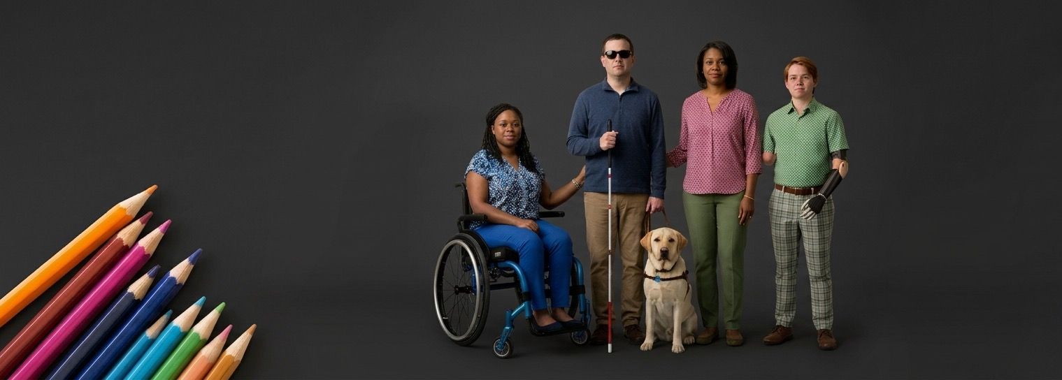
Somewhere, right now, someone is trying to submit a support ticket with a screen reader, or fill in a form after a stroke has changed how they process visual information, or navigate a dashboard with a keyboard because a mouse is not an option today. They did not choose to need more from the software they are using. The software either meets them there, or it does not.
That is the premise Mandala Design System is built on. Not as a compliance exercise bolted onto finished components, but as the starting condition for every decision that follows.
A floor, not a ceiling
Every component in this system is built to WCAG 2.2 Level AA as a mandatory baseline. That is not a target I aim for and sometimes miss; it is the floor beneath which nothing ships.
I did not build this on a single accessibility .md file. The whole of my accessibility course is built into the system, together with links to multiple resources that the AI reads before it builds anything.
Meeting legal requirements
Building properly to that standard also means I am already meeting obligations that are no longer optional.
Section 508 in the United States sets WCAG 2.0 Level AA as its bar. The European Accessibility Act relies on the European standard EN 301 549, which until now has pointed to WCAG 2.1 and was updated in 2026 to align with WCAG 2.2, with its formal EU recognition still to come.
Because every WCAG 2.2 Level AA requirement builds on the earlier versions, a component that meets 2.2 also meets 2.0 and 2.1, which means the groundwork for compliance is already in place today under both, and Mandala already meets the version the European standard now uses. This is not the reason accessibility matters here, but it is a welcome consequence of doing the work properly in the first place, rather than treating compliance as a separate scramble once a product is already built.
Structural, not aspirational
The difference between a design system that talks about accessibility and one that enforces it comes down to a simple test: what happens when someone forgets?
In Mandala, the answer is that the system catches it before it ships.
Every component carries its accessibility specification alongside its code, not as an afterthought written up later, and that specification records the full lists of both automated and manual tests performed on it.
Both lists matter, and neither is a formality.
Automated checks run on every story in Storybook, and static analysis flags unsafe patterns before a pull request is even reviewed, but automated testing covers only part of what accessibility asks of a component, and nowhere near all of it. For that reason every component also has a list of manual tests, as long as its automated one, that a human must perform before it can pass.
This is a large part of what human-governed and AI-powered means in practice: a person performs as many tests as the AI does, because that is how accessibility works. Nothing is called finished until both lists are complete and everything passes, and every component clears three separate gates: the code itself, the manual testing, and a final sign-off that checks the work against every decision the team has already locked in.
Wrong output should be structurally impossible, not just discouraged. That principle shapes the tooling as much as it shapes the components.
Built for the people who rely on it most
- Colour is never the only way I communicate meaning.
- Every interactive element has a name a screen reader can announce, whether or not it has a visible label.
- Focus is always visible, and it never fires an action just by landing somewhere.
- Disabled controls stay reachable and explain themselves, rather than vanishing from the tab order the way a native disabled attribute would.
None of these are edge cases. They are the ordinary, daily experience of people who use assistive technology, and they are treated as such.
Verified, not assumed
- 1.3.1 Info and Relationships
- 1.4.3 Contrast (minimum)
- 1.4.4 Resize text
- 1.4.10 Reflow
- 1.4.11 Non-text contrast
- 1.4.12 Text spacing
- 1.4.13 Content on hover or focus
- 2.1.1 Keyboard
- 2.3.3 Animation from interactions
- 2.4.7 Focus visible
- 2.5.8 Target size (minimum)
- 4.1.2 Name, role, value
- 4.1.3 Status messages
Every accessibility claim in this system is backed by evidence, tagged against the specific WCAG criterion it satisfies. That evidence exists so it can be checked, questioned, and eventually compiled into a formal conformance report; accessibility that cannot be demonstrated is not much better than accessibility that was never considered.
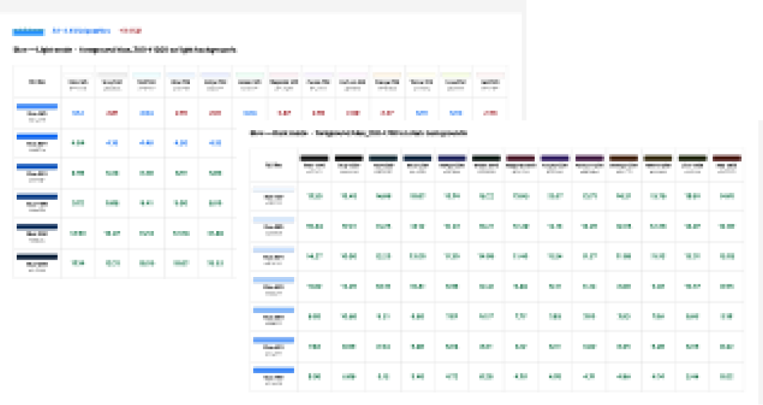
The Button shows what that looks like in practice. It was tested against 13 WCAG criteria: 10 through both automated and manual testing, 2 through automated testing only, and 1 through manual testing only. In total that meant 27 automated tests and 30 manual ones. On colour contrast alone, axe ran 468 tests covering every contrast requirement across the 18 colour themes, and found 0 violations. Other components need even more tests.
Having AI run these tests across all the colour themes, and carry out the other automated tests too, saved a huge amount of time. The time saving only works because of how the system was set up from the beginning: accessibility is built into the foundations, so issues are prevented and not caught during testing. The tests are there to prove that it holds.
Documented alongside the code
Every component I ship carries its own accessibility specification, written alongside the code rather than after it. For every component it documents the keyboard behaviour, the focus behaviour and anything else someone needs to use it accessibly, so anyone reaching for it can see exactly how it behaves and why.
Mandala: a living design system
This is a living system, and it will keep growing. What will not change is the standard it is held to, or the belief underneath it: that good design has never had to choose between looking right and working for everyone.