Mandala: The colour story
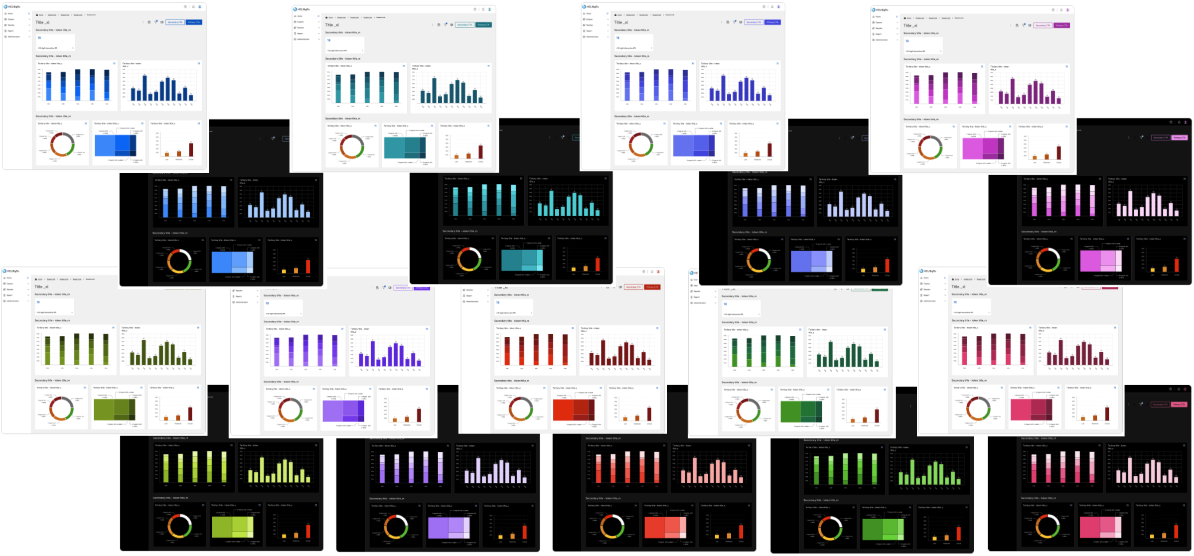
Every hue chosen by hand
Every colour in Mandala was chosen by me, by hand, using my designer-trained human eyes.
AI did not decide a single hue, and that is one of the things that makes this system special, because anyone can ask an AI for a mathematically perfect colour system with twelve steps for every hue. What an algorithm cannot do is look at a screen.
I tested every palette on multiple screens, and I tested how people with colour blindness experience each one, because I consider that judgement far better made by a person than by a formula.
Built backwards, on purpose
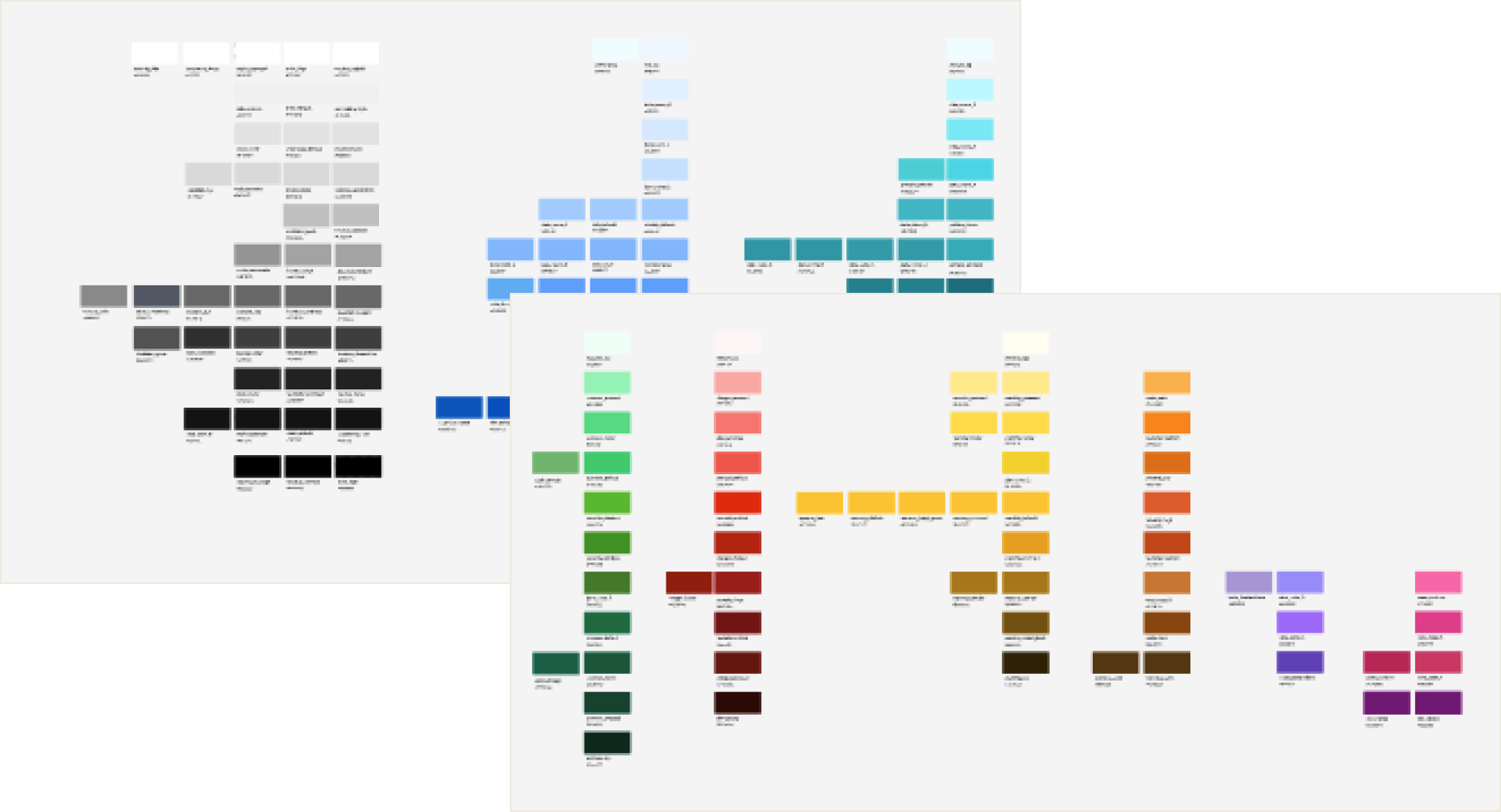
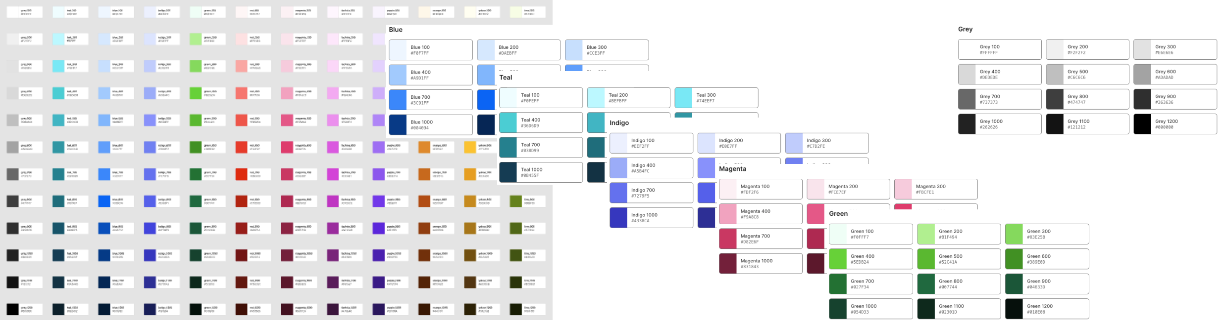
Most colour systems are built in one direction: a primitive scale first, numbered steps of a hue, with semantic roles like primary or danger attached to whichever step suits. Mandala had to go the other way. The semantic tokens already existed and already carried real decisions and real usage across a live product, long before any primitive scale sat underneath them, so the palette had to be fitted to choices that were already made. That is a harder problem, and every one of the eighteen themes had to resolve cleanly against tokens that were never designed with a scale in mind.
I did not start from a blank page either. The primitives sit on top of a colour system that already existed and that I had also built by hand. I mapped every existing colour to a palette myself, added whatever was missing to reach the full twelve steps, and kept the number of colours that had to change as small as I could, so that I stayed on good terms with engineering. Then I landed on a palette, tested it, went back and refined it, tested again, and repeated that cycle until it held.
The result is eighteen full themes built from shared primitives, with room held in reserve for a high-contrast theme still to come.
The final palettes meet the contrast requirements and are usable for most people with colour blindness, and all of it is documented rather than assumed. So far, with multiple components built, literally thousands of tests have been performed on colour contrast without a single error, so the palettes hold.
AI's part was the volume. Claude ran the contrast checks across the eighteen themes and built the hundreds of documentation cards in Figma and Storybook, and it did that busy work better than I could have.
That split is the clearest example in Mandala of what human-governed, AI-powered means.
A private copy, not a live rebuild
Mandala is not being built on top of the system other teams use every day. It is being built inside an isolated working environment in Figma: a complete copy of the existing colour libraries, components and structure, visible only to me, my closest team and Claude, while the libraries in daily use stay untouched until Mandala is ready to take their place. That separation is deliberate: every experiment, wrong turn and structural change described below happened somewhere nobody was relying on, which is exactly what made it safe to take them.
The audit that cried wolf, four times
A full audit of the working copy flagged four apparent defects, and all four were the same mistake. A spreadsheet disagreed with the design, and the audit believed the spreadsheet. A colour that seemed invisible sat on a layer nobody could see. A “misnamed” border was a hand-drawn outline behaving as intended.
Four times running the audit cried wolf, and four times the wolf turned out to be the family dog.
The fix was not a cleverer scan but a rule: before calling anything broken, go and look at the actual picture, with human, designer-trained eyes.
The design file is the truth. The variable that claims to represent it is not.
The day the fix broke what it was fixing
Looking at the actual picture also caught the one real failure. A batch correction of focus outlines deleted them on thirty buttons at once, an accessibility regression caused by the process meant to improve accessibility. A verification check reported zero outlines left, and the instinct was to assume the check was broken. It was not.
Believing an alarming result rather than explaining it away is now a standing rule. The outlines were restored the same day, in a file nobody outside the project could see.
A check that has never failed has never been tested.
Two libraries, the same name and years of history
The working copy came from a system with years of history, and that history came with it. While I was tracking down a few stray colour bindings, I found something nobody had documented: two colour libraries in the same file, with the same name and the same four theme modes. A component took its colour from whichever library happened to be open in the variable picker on the day someone built it, so teal and blue, which belong to two different products and should never be mixed, were ending up on the same screens. Putting that right meant moving tens of thousands of colour decisions across, one screen at a time, each one checked rather than assumed. None of this ever reached a real user.
One palette, many faces
The same colour system now runs underneath the icons and the illustrations.
There are 180 icons, each one a component that points at a path and takes the colour of its container, so no icon has to be exported in several colours, and the code stays lighter and easier to maintain. The illustrations work the same way. They are paths too, and each one adapts to the colour theme, picking up the primary colour of the team using it and personalising part of the artwork in that colour.
Eighteen themes, zero contrast defects
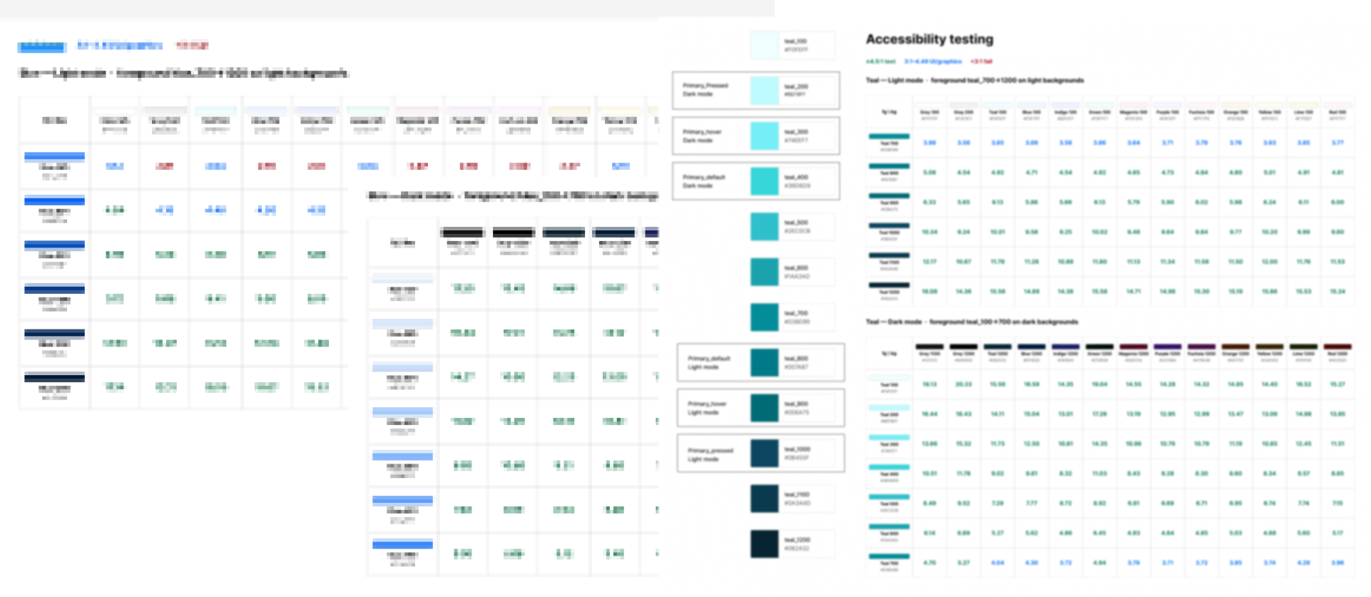
All eighteen themes are fully accessible and meet WCAG 2.2 AA. Having AI run the tests saved a huge amount of time, but the time saved is not the real story. The system was set up well from the beginning, so contrast problems are prevented before testing starts, and the tests are there to prove that it holds.
Why this is worth telling
Colour shows the whole method at once: a private space to be wrong in safely, an audit disciplined enough to doubt its own findings, a mistake caught because an alarming result was believed rather than explained away, and a system stable enough that hundreds of automated checks find nothing to fix.
None of it required the old system to be broken. It required patience with a system that was never built to be read by a machine, and a great deal of looking at the actual picture instead of the report about the picture.
The colours are what people see.
The patience behind them is what lets everyone see them.